
Echo: Cal Poly Design & Dev Hackathon 2016
At the Cal Poly Design & Dev Hackathon 2016, I worked on a team of 6 to conceptualize, design, and develop a mobile app called Echo during a 24 hour timespan. Echo is an app designed to improve communication, specifically in regards to difficult topics, between people in both personal and professional relationships. Echo works similarly to Tinder for tough conversation topics. Each user selects from a variety of conversation topics, and if the two partners or users match on conversation topics, an “echo” is sounded. Each user will receive a notification and the option to call or message the other person or the option to set a reminder alarm for later. The point of the application is not to encourage a text message conversation but to ultimately provide context in order to easily start the conversation.

Initial brainstorming of the application's functions and content

Working on our user stories

Rough wireframes of the application
Roles & methods
I served as the UI and UX design lead for this hackathon and worked with two other designers on the application. We also collaborated with two business/idea people to work on the concept and UX design of the application. We worked on user stories to better understand the types of needs and pain points users would have when using Echo.
Our process of developing the app starting with brainstorming the main vision of the application, its name, and primary functions. We sketched on whiteboards and papers, conducted online research about the UI design, and bounced ideas back and forth. Our two business/idea team members helped with creating user stories and developing a context for our app. Once we felt confident in our goals and direction, we set about creating wireframes for the application and then moved onto the UI design and branding.

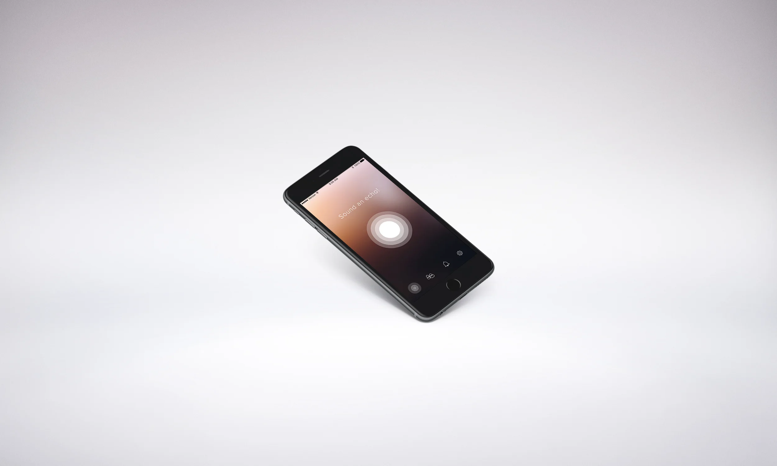
Sounding and receiving echoes
Challenges
The scope and UX design of Echo presented significant challenges to the team. In a 24 hour period, it was very difficult to flesh out every question and concern we had for the app. We also felt that the app had much greater potential than we could achieve in the time span. With such a time crunch, we chose to focus on a few important elements and build our app from there. We sought to solve one of the bigger issues of giving people the context to start a difficult conversation. The application, in and of itself, could give users agency to initiate a conversation given that each partner knows they both want to discuss specific topics.
Sounding & Receiving Echoes
The above screens represent two of the main actions within the app: sounding an echo or receiving an echo. Through these two actions, a conversation between two people can be more easily initiated. On a high level, sounding and receiving echoes are the aim of this app, and will help people to feel more empowered to have important conversations.

Choosing conversation topics
Choosing topics
The screens above represent part of the process of choosing conversation topics. These topics specifically relate to a romantic relationship, but theoretically would be function to accommodate all types of personal and professional relationships. When a user wants to sound an echo, they choose main categories and within those categories, they can choose sub-topics.
Tools Used: Sketch, Adobe Illustrator, Adobe Photoshop
April 2016
